

- 1. Microsoft PowerPoint
- 2. Google Slides
- 3. Apple Keynote
- 4. Canva
- 1. Cognitive Ease
- 2. Enhanced Memory Retention
- 3. Emotional Engagement
- 4. Fosters Comparison and Contrast
- How to Use Harvey Balls in Your Presentations: A Step-by-Step Guide
- The Benefits of Using Harvey Balls in Presentations
- How to Create Harvey Balls in Various Software
- Different Ways to Use Harvey Balls in Presentations
- Designing Your Own Harvey Balls
- Harvey Balls in the Modern Business World
- Beyond Harvey Balls: Other Visual Representation Tools
- Final Tips
Introduction
Harvey Balls – they may sound unfamiliar to some, but to those entrenched in the world of presentations, they are a vital visual representation tool. These simple yet effective symbols are widely recognized for their capacity to convey complex data in an intuitive manner. Their importance in presentations is paramount, offering an efficient means to represent qualitative information visually. As we delve deeper into the realm of Harvey Balls, you’ll discover their rich history, applications, and tips to maximize their effectiveness in your presentations.
History and Evolution of Harvey Balls
At their core, Harvey Balls are circular symbols used to represent qualitative data visually. Their origins are intriguing, primarily rooted in traditional business and finance scenarios, where conveying information efficiently and quickly was vital. Over time, these symbols have transcended their original purpose, finding a prominent place in modern-day presentations across various fields.
The evolution of Harvey Balls is a testament to their adaptability and enduring utility. From black-and-white printouts in boardroom meetings of the past to vibrant, animated digital presentations today, they’ve maintained their essence while adapting to changing aesthetic and functional demands. Their transition from traditional uses to PowerPoint slides and digital platforms highlights a unique blend of simplicity and versatility that few visual tools possess.
The Anatomy of Harvey Balls
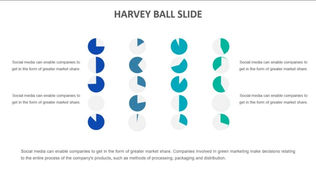
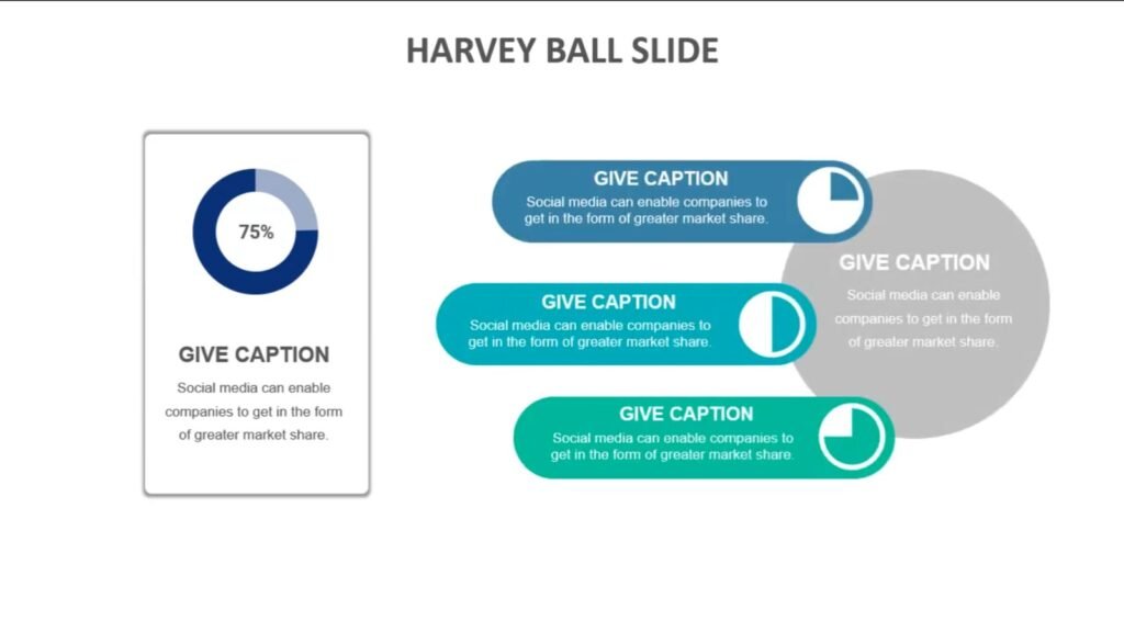
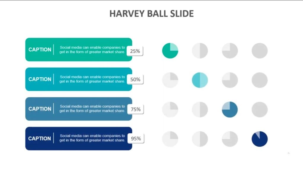
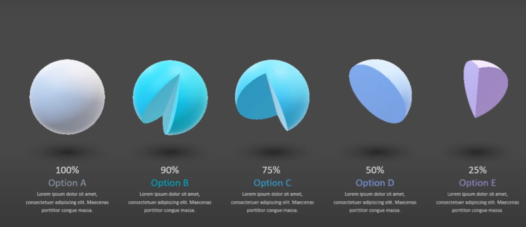
Delving deeper into what these symbols are, Harvey Balls come in varied forms, each representing a different degree of a certain criterion. The most common types are:
- Full Ball: Denotes 100% or complete fulfillment of a criterion.
- Three Quarter Ball: Indicates around 75% completion or satisfaction.
- Half Ball: Represents 50% or a mid-point measurement.
- Quarter Ball: Signifies 25% or a lower degree of fulfillment.
These symbols are universally recognized, transcending language barriers, and cultural differences. Their power lies in their simplicity. With just a glance, viewers can grasp the essence of the data being presented. In a world where attention spans are dwindling, the immediate clarity that Harvey Balls provide is invaluable.
Why Use Harvey Balls in Presentations?
Harnessing the power of visual tools in presentations can significantly elevate your audience’s understanding and engagement. Harvey Balls, despite their simplicity, pack a punch in this regard. Here’s why they are a go-to choice for many presenters:
- Instant Clarity: Harvey Balls simplify complex data, making it digestible at a mere glance. They eliminate the need for verbose explanations, ensuring your audience remains engaged.
- Versatile Application: They are not limited to any specific field or topic. Whether you’re discussing market research, product comparisons, or any qualitative data, these symbols can seamlessly fit in.
- Cultural and Linguistic Universality: Their universal design ensures that regardless of the audience’s background, the message conveyed is consistent and unambiguous.
- Enhances Aesthetic Appeal: With the right color schemes and designs, Harvey Balls can make your slides look professional and visually appealing, leaving a lasting impression on your audience.
- Optimized for Digital Platforms: As presentations transition to digital platforms, Harvey Balls have evolved too. They’re easily integrable into popular presentation software, making them a valuable tool in the modern presenter’s arsenal.
Crafting the Perfect Harvey Balls for Your Slides
Using Harvey Balls effectively goes beyond just inserting them into your presentation. Here’s a step-by-step guide to ensure they truly enhance your slides:
- Understand Your Data: Before representing data with Harvey Balls, have a clear understanding of what you want to convey. Determine the criteria and their degrees of fulfillment.
- Choose the Right Type: Based on the data, select the appropriate Harvey Ball (Full, Three Quarter, Half, or Quarter).
- Consistency is Key: Ensure uniformity in size, color, and style throughout your presentation. This maintains a professional look and avoids confusing your audience.
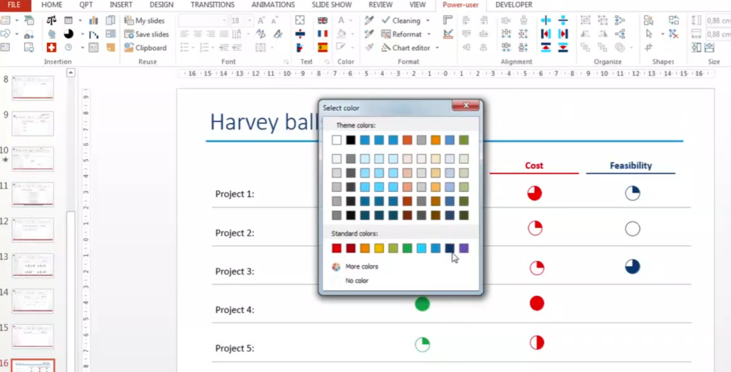
- Color Matters: If you’re using colored Harvey Balls, ensure the colors align with the theme of your presentation and the emotions you wish to evoke. For instance, green might denote positive, red for negative, and yellow for neutral.
- Placement: Position them strategically on your slide, ensuring they’re easily viewable and don’t clutter or overwhelm other elements.
Applications and Examples
Harvey Balls are not just theoretical tools; their real-world applications are vast and varied. Here are some insightful general examples:
- Market Research Analysis: A leading market research firm utilizing Harvey Balls to represent consumer satisfaction levels across different product categories. The visual representation enabled stakeholders to quickly identify strong performers and areas of improvement.
- Product Comparisons: An e-commerce platform integrating Harvey Balls in their comparison charts, allowing users to visually compare features of different products, enhancing the user experience and increasing conversion rates.
- Educational Assessments: A renowned educational institution employing Harvey Balls to represent student performance in various criteria, giving educators a clear picture of areas where interventions were needed.
Common Missteps and How to Avoid Them
Even though Harvey Balls offer a multitude of advantages in presentations, it’s not uncommon to come across slides where they have been misused or overused, diminishing their potential impact. Here’s a rundown of some common pitfalls and how to steer clear of them:
- Overcomplicating the Slide: One of the primary purposes of Harvey Balls is to simplify. But, if you crowd your slide with too many of them, you’ll end up defeating that purpose. Limit their usage to where they genuinely add value.
- Inconsistent Representation: Using different styles or sizes of Harvey Balls within the same slide or presentation can confuse your audience. It’s imperative to maintain a consistent design language.
- Color Misuse: Using too many colors or ones that clash can divert the audience’s attention from the content. Stick to a cohesive color palette that complements your presentation’s overall theme.
- Ignoring Legend/Key: Especially when presenting to a new audience or one unfamiliar with Harvey Balls, always include a key or legend. It aids in understanding the degree of fulfillment each symbol represents.
- Over-Reliance: While Harvey Balls are fantastic, relying solely on them can be a mistake. They should complement other visual aids and not replace them entirely.
Diving Deeper: The Origin of Harvey Balls
For those intrigued by the name, Harvey Balls originate from a fascinating backstory. They were conceived by Harvey Poppel, a consultant, who wanted a straightforward way to represent qualitative data without resorting to long-winded explanations. The simplistic design of the Harvey Ball – resembling phases of the moon – was intentional, ensuring a universal appeal and understanding.
Over time, they’ve been adopted across sectors – from corporate boardrooms to academic institutions, testament to their enduring utility and simplicity.
Tips for Integrating Harvey Balls in Popular Presentation Software
Given that most presentations today are created using digital tools, it’s vital to know how to seamlessly integrate Harvey Balls into your favorite software:
- PowerPoint: Microsoft PowerPoint offers in-built Harvey Ball icons. Simply navigate to Insert -> Symbols and select the Harvey Ball of your choice. You can then customize their size and color to fit your slide.
- Google Slides: While Google Slides doesn’t have native Harvey Ball symbols, you can easily insert them as images or use add-ons that offer a plethora of symbols, including Harvey Balls.
- Keynote: For Apple Keynote users, the process is similar to PowerPoint. You can find Harvey Ball symbols in the shape library and adjust them as required.
- Custom Design Tools: If you’re using tools like Canva or Adobe Illustrator, you can design customized Harvey Balls or use available templates. These tools offer more flexibility in terms of design and customization.
Whichever software you choose, always remember to keep the design consistent and in line with your presentation’s theme.

How to Custom Create Your Own Harvey Balls
Sometimes, the default Harvey Balls available in presentation software might not fit the aesthetic or tone of your presentation. In such cases, creating your own customized Harvey Balls can be both fun and impactful. Here’s a step-by-step guide to crafting your own:
- Choose the Right Tool: Opt for a design tool you’re familiar with. Adobe Illustrator, Canva, or even Microsoft Paint can be good options, depending on your proficiency.
- Start with a Circle: Draw a perfect circle. This will form the base of your Harvey Ball. Ensure it’s clean with no jagged edges.
- Decide on Segmentation: Depending on the value you want to represent, divide the circle. For instance, if you’re depicting half completion, you’ll shade one half of the circle.
- Shading and Coloring: Choose a color that matches your presentation’s theme. Fill the segmented parts with the chosen color. Remember, consistency is crucial, so make sure all your Harvey Balls use the same color palette.
- Size Matters: Keep in mind where these Harvey Balls will be used. If they are going on a large presentation screen, ensure they are of high resolution and not pixelated.
- Save Correctly: Save your custom Harvey Balls in a format that retains their quality and is easily insertable in presentation tools, like .png or .svg.
- Test Before Finalizing: Before you roll them out across your slides, test a few. Insert them into a slide, view it in presentation mode, and ensure they look crisp and clear.
Enhancing Your Presentation Skills Alongside Using Harvey Balls
Using Harvey Balls is just one aspect of creating an effective presentation. To truly captivate and inform your audience, consider the following tips:
- Storytelling is Key: Weave a narrative throughout your presentation. Starting with a problem, leading to a solution, and ending with results can be a straightforward yet effective structure.
- Interactivity: Engage your audience. Ask questions, create polls, or have short Q&A sessions to make your presentation a two-way communication.
- Consistency: This isn’t just about design. Ensure the tone, language, and flow of your presentation remain consistent from start to finish.
- Practice: Familiarize yourself with the content. Practice delivering your presentation multiple times to iron out any kinks and ensure smooth delivery.
- Feedback Loop: After your presentation, seek feedback. Understand what worked and what didn’t. This will be invaluable for future presentations.
By incorporating Harvey Balls effectively and honing your presentation skills, you’re on your way to creating compelling, insightful, and memorable presentations. Remember, the goal is to communicate information clearly and persuasively, and Harvey Balls, when used right, can be a powerful tool in achieving that.
Harvey Balls Across Different Platforms
In today’s age, there’s a myriad of tools and platforms available for creating presentations. While the significance of Harvey Balls remains consistent, the method of incorporating them can vary. Here’s a look at how you can integrate Harvey Balls in some of the most popular platforms:
1. Microsoft PowerPoint
Arguably the most widely-used tool, PowerPoint provides a few different ways to include Harvey Balls:
- Insert Symbol: Go to the ‘Insert’ tab and choose ‘Symbol’. In the font dropdown, select ‘Wingdings 2’, and you will find Harvey Balls symbols which can be inserted directly into your slide.
- Use Shapes: Another method is to utilize the ‘Shapes’ tool. Create a circle and shade it according to your requirements.
- Download and Insert: There are various online resources where you can download Harvey Balls icons in image format, which can then be inserted into your slides.
2. Google Slides
For those who prefer cloud-based tools, Google Slides is a great option:
- Insert Drawing: Navigate to ‘Insert’ and then ‘Drawing’. Use the shape and fill tools to create your custom Harvey Balls.
- Copy-Paste from Web: As with PowerPoint, you can download or copy images of Harvey Balls from the internet and paste them directly into your slides.
3. Apple Keynote
For the Apple aficionados, Keynote is the tool of choice:
- Use Shapes: Keynote offers a variety of shape tools. Draw a circle and segment it as needed, then apply your desired colors.
- Insert Image: Again, you can find Harvey Balls images online and simply drag and drop them into your Keynote slides.
4. Canva
The design platform Canva is increasingly becoming a go-to for many:
- Search in Elements: Within Canva, go to ‘Elements’ and search for ‘Harvey Balls’. Many predesigned options will appear, ready to be dragged and dropped into your design.
- Custom Design: Use the shape tools in Canva to draw and color your own Harvey Balls.
Key Takeaways:
- Harvey Balls are universally recognized, so regardless of the platform, their interpretation remains consistent.
- Most tools provide a way to either directly insert or custom create Harvey Balls.
- The method of integration may vary, but the objective remains the same: clear and efficient data representation.
By understanding how to implement Harvey Balls in your preferred platform, you ensure a seamless experience while retaining the power of this effective visual tool. The versatility of Harvey Balls ensures that they remain relevant across diverse platforms, elevating the quality of presentations everywhere.
The Psychological Impact of Harvey Balls in Presentations
The human brain is wired to respond to visuals faster than text. This rapid processing can be leveraged in presentations to drive points home more effectively, and Harvey Balls serve this purpose perfectly. Here’s a deep dive into the psychological impacts of using these simple yet powerful symbols:
1. Cognitive Ease
- Simplicity is Key: Our brains love simplicity. Harvey Balls, with their uncomplicated design, reduce cognitive load. Readers don’t have to spend extra energy decoding the meaning, making the information more digestible.
- Instant Recognition: The shape and shading of Harvey Balls provide immediate context. Instead of wading through text or intricate graphs, the viewer gets a quick understanding, fostering swifter decision-making.
2. Enhanced Memory Retention
- Visual Recall: Humans remember visual data better than written information. Incorporating Harvey Balls aids in better retention of the presented data, making your presentation more memorable.
- Consistency Boosts Recognition: Using Harvey Balls consistently throughout your presentation can act as a mnemonic device. Over time, your audience will instinctively recognize and comprehend them, facilitating smoother communication.
3. Emotional Engagement
- Breaking Monotony: Long textual slides can make a presentation tedious. Harvey Balls break the monotony, adding a visual element that keeps the audience engaged.
- Positive Association: Our brains tend to associate simple, clear visuals with trustworthiness. By making data interpretation straightforward with Harvey Balls, you can foster a positive emotional response, enhancing your presentation’s credibility.
4. Fosters Comparison and Contrast
- Visual Differentiation: Harvey Balls allow for easy comparison of data points. Their distinct shading provides a visual differentiation that can highlight disparities or similarities more vividly than text alone.
- Holistic Overview: By providing a condensed view of data, Harvey Balls enable the audience to see the bigger picture, promoting holistic understanding and analysis.
Quote: “The simpler you say it, the more eloquent it is.” – August Wilson
Key Takeaways:
- Harvey Balls cater to our brain’s preference for visual data, enhancing understanding and retention.
- They foster emotional engagement, breaking monotony, and building trust.
- Their distinct design aids in data comparison, providing a broader perspective.
The psychological potency of Harvey Balls is undeniable. By integrating them into your presentations, not only do you make your data more accessible, but you also engage with your audience on a deeper cognitive and emotional level, ensuring your message resonates and remains memorable.
How to Use Harvey Balls in Your Presentations: A Step-by-Step Guide
Harnessing the power of Harvey Balls for your presentations can bring a fresh, visual appeal while conveying your message effectively. Here’s a practical step-by-step guide to help you integrate them seamlessly:
1. Understand Your Data
Before diving into design, thoroughly understand the data you want to represent. Ask yourself:
- What metrics or criteria are you evaluating?
- How can you categorize this data in terms of completeness or achievement? For instance, is it a binary “done/not done” or can it be represented in progressive stages?
2. Choose the Right Tool
While several professional tools allow the inclusion of Harvey Balls, Microsoft PowerPoint remains a favorite due to its ubiquity and ease of use. Most presentation software offers Harvey Balls either as symbols or you can easily import them as images.
3. Inserting Harvey Balls in PowerPoint
Here’s a basic rundown for PowerPoint:
- Navigate to the “Insert” tab.
- Click on “Symbols”.
- From the symbol dialog box, choose the “Segoe UI Symbol” font. You’ll find a variety of Harvey Balls to choose from.
- Select the desired symbol and click “Insert”.
4. Scale and Position
Ensure that the Harvey Balls are of consistent size throughout your presentation. They should be large enough to be discernible but not so large that they overshadow the accompanying text or other graphics.
5. Use a Legend
Always provide a legend or a brief descriptor to ensure clarity. For example, a completely filled Harvey Ball might denote “Task Completed,” while a quarter-filled one could indicate “25% Progress.”
6. Maintain Visual Consistency
Make sure to maintain a consistent color scheme and style. If you’re using other visual elements like charts or graphs, ensure that the Harvey Balls complement them in terms of design and color.
7. Test Your Slides
Before the actual presentation, test your slides on different devices to ensure they render correctly. Show them to a colleague or friend to gather feedback on clarity and visual appeal.
Remember, while Harvey Balls are an excellent tool to simplify complex data, they should be used judiciously. Overloading your presentation with too many symbols can counteract their effectiveness. Strive for a balance between text, symbols, and other visual elements to achieve the desired impact.
The Benefits of Using Harvey Balls in Presentations
Harvey Balls have become a staple in the presentation world for several compelling reasons. Their simplicity, visual appeal, and versatility offer a plethora of advantages. Let’s delve deeper into why they can be an excellent addition to your presentation toolkit.
1. Simplifies Complex Data
At the heart of a powerful presentation is the ability to convey intricate information succinctly. Harvey Balls, with their easily decipherable design, can represent data in a way that’s instantly understood, eliminating the need for lengthy explanations.
2. Enhances Visual Appeal
A monotonous presentation laden with text can quickly lose the audience’s interest. Interspersing Harvey Balls breaks the monotony and provides visual relief, making your slides more engaging.
3. Facilitates Quick Comparisons
Harvey Balls are exceptional when it comes to side-by-side comparisons. Whether you’re contrasting product features, project progress, or any other comparative data, these symbols can quickly highlight differences and similarities.
4. Versatile across Industries
One of the standout attributes of Harvey Balls is their adaptability. Whether you’re in finance, healthcare, education, or technology, these symbols can be tailored to represent data pertinent to your field.
5. Space Efficient
Space is often at a premium in presentations. Harvey Balls, given their compact nature, can convey data without hogging slide real estate, allowing you to maintain a clean and uncluttered look.
6. Encourages Audience Engagement
Because Harvey Balls require a degree of interpretation (albeit simple), they can encourage your audience to engage more actively with the content. The moment of “decoding” the symbol’s meaning can lead to better retention.
In essence, Harvey Balls offer a blend of simplicity and sophistication. They encapsulate data in a format that’s both intuitive and visually pleasing, making your presentations more impactful and memorable. As with any tool, the key lies in understanding when and how to use them to their best effect.
How to Create Harvey Balls in Various Software
Creating Harvey Balls might seem like a daunting task at first, especially if you’re not familiar with graphic design. However, most common software tools offer relatively straightforward methods to incorporate them into your presentations. Here’s a step-by-step guide for some popular platforms:
1. Microsoft PowerPoint
PowerPoint is, without a doubt, one of the most commonly used tools for presentations, and creating Harvey Balls in it is a breeze.
Step-by-step:
- Open a new slide and navigate to the “Insert” tab.
- Choose the “Shapes” dropdown.
- From the list of shapes, select the “Oval” shape.
- Draw a perfect circle by holding the ‘Shift’ key while dragging.
- To fill part of the circle, right-click on the circle, choose ‘Format Shape’, then ‘Fill’, and select the ‘Gradient fill’ option. Adjust the gradient stops to achieve the desired Harvey Ball effect.
2. Google Slides
If you’re more inclined towards cloud-based tools, Google Slides offers a similarly simple process.
Step-by-step:
- Start a new slide and go to the “Slide” menu.
- Choose the “Shape” option, then “Shapes”, and pick the “Oval” shape.
- Like in PowerPoint, draw a circle by holding down ‘Shift’.
- For partial fills, utilize the gradient fill option under the “Fill color” dropdown. Adjust the sliders to get the Harvey Ball look.
3. Adobe Illustrator
For those seeking a more refined and customizable design, Adobe Illustrator is the way to go.
Step-by-step:
- Launch Illustrator and create a new document.
- Use the “Ellipse Tool” from the toolbox or press the ‘L’ key.
- Draw a circle and choose the “Gradient” tool or ‘G’ key.
- Apply a radial gradient and adjust the color stops to emulate a Harvey Ball.
Remember, while these steps provide a basic guide, feel free to experiment and tweak the design to better fit your presentation’s aesthetic.
Creating Harvey Balls is more about understanding the process than possessing inherent design skills. Once you’ve got the hang of it, you’ll find them to be versatile assets in your presentation toolkit.
Different Ways to Use Harvey Balls in Presentations
Harvey Balls are not just simple design elements. When used effectively, they can enhance the comprehension of your content and make your presentations more engaging. Here’s a deep dive into various ways to incorporate them:
1. Product Comparisons
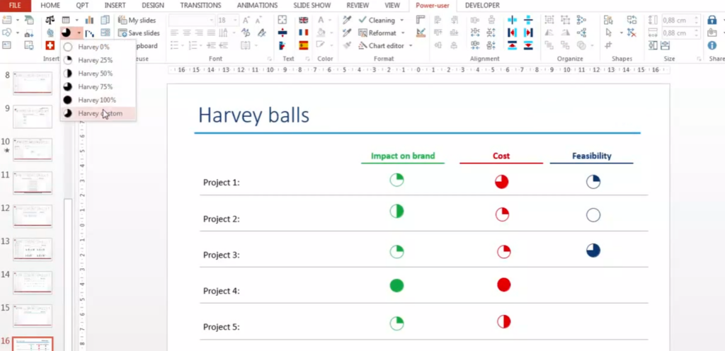
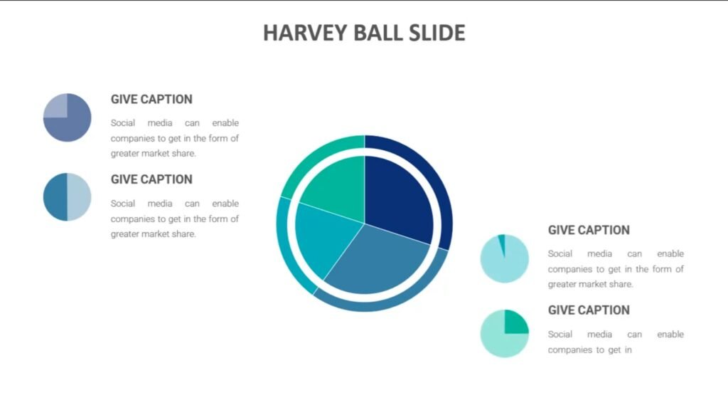
When presenting multiple products or services, you can use Harvey Balls to compare features easily. For instance, if you’re comparing software tools, you might have features like “User-Friendly Interface”, “Cloud Integration”, or “Advanced Analytics”. By assigning different Harvey Balls to each feature (from empty to full), you can visually indicate how well each software tool meets that particular criterion.
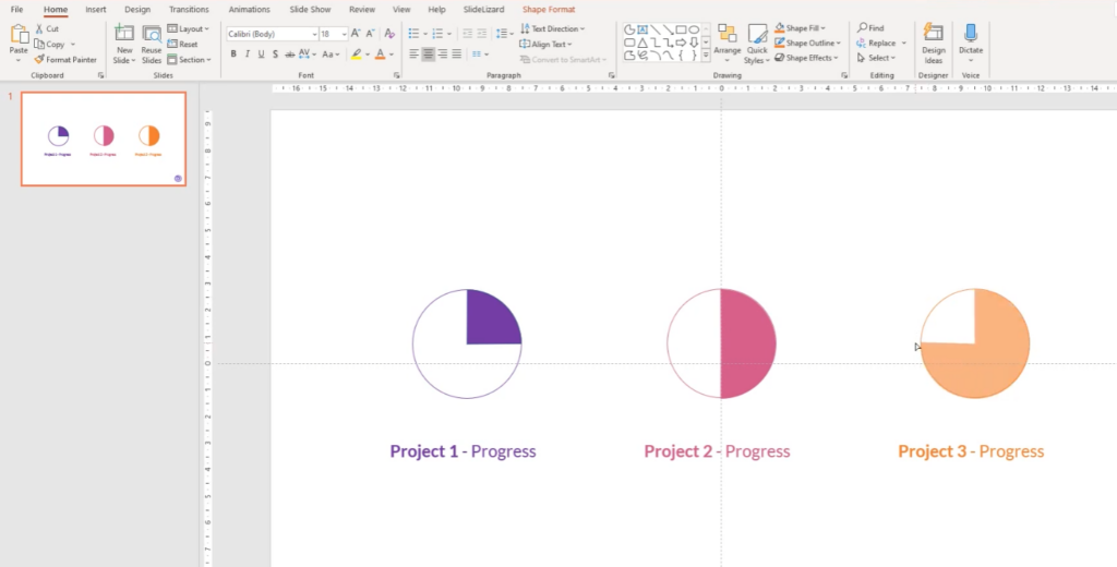
2. Progress Tracking
If your presentation is about project progress or milestones achieved, Harvey Balls can serve as a visual representation. Let’s say you’re updating stakeholders on the completion status of five different projects. Using Harvey Balls, you can instantly show how close each project is to completion without delving into percentages or detailed explanations.
3. Skill Evaluations
For HR presentations or workshops, Harvey Balls can be used to depict proficiency levels in specific skills. For instance, if assessing the skill set of a team on various tools like Photoshop, Excel, and Java, Harvey Balls can visually present each member’s expertise level, offering a quick and efficient overview.
4. Survey Results and Feedback
When presenting feedback from customer surveys or internal evaluations, Harvey Balls can illustrate satisfaction levels. If your survey had questions about product usability, customer support responsiveness, or overall satisfaction, the Harvey Balls can highlight areas where the response was overwhelmingly positive or areas needing improvement.
5. Risk Assessments
In business strategy sessions or project reviews, risk assessment is crucial. Using Harvey Balls, you can showcase the severity or likelihood of specific risks. For high-risk items, a filled Harvey Ball would immediately draw attention, prompting discussions and potential mitigation strategies.
In essence, Harvey Balls are all about visual simplification. They convey complex data or comparative information in a digestible format, allowing your audience to grasp the message quickly and intuitively. As the old adage goes, “A picture is worth a thousand words”, and in the realm of presentations, Harvey Balls undoubtedly resonate with this sentiment.
Designing Your Own Harvey Balls
While many presentation tools and software come with pre-designed Harvey Balls, there might be times when you need a more customized design or simply want to experiment with different visuals. Let’s delve into the world of designing your own Harvey Balls and making them fit seamlessly into your presentation:
1. Choose the Right Software
While PowerPoint is the most common tool for presentations, tools like Illustrator or CorelDRAW offer more flexibility for design. These graphic design software platforms allow you to create vector graphics, ensuring that your Harvey Balls remain crisp and clear, irrespective of scaling.
2. Simple Shapes Work Best
Remember, the primary purpose of Harvey Balls is to convey information simply and effectively. Therefore, while designing, stick to basic shapes. Circles are the most common, but depending on your content, squares, triangles, or even hexagons can be used.
3. Consistency is Key
Ensure that all Harvey Balls in a single presentation are consistent in size, color, and style. If you’re using different shades or patterns, they should have a clear hierarchical relation or meaning. A jumble of unrelated styles will confuse rather than enlighten your audience.
4. Play with Colors
Though traditionally black and white, there’s no harm in using colors, especially if they align with your overall presentation theme or branding. However, make sure the colors are easily distinguishable and aren’t too jarring.
5. Test on Different Backgrounds
Especially if your presentation uses varying slide backgrounds, ensure that your Harvey Balls are visible on all of them. A light-colored design might look great on a dark background but could be nearly invisible on a light one.
6. Use Legend or Key Wisely
If you’re using variations in your Harvey Balls – like different colors or patterns – always include a legend or key. It ensures that the audience knows what each variation represents, adding clarity to your content.
Incorporating custom-designed Harvey Balls can add a unique touch to your presentations, setting them apart from generic templates. Just ensure that in the pursuit of creativity, the primary objective – clear communication – isn’t lost.
Designing isn’t just about aesthetics. It’s about forging that perfect balance between visual appeal and effective communication. And when done right, Harvey Balls can be that little detail that elevates your presentation from good to exceptional
Harvey Balls in the Modern Business World
The adaptability of Harvey Balls ensures their relevance even in today’s data-driven business landscape. Their simplicity in visually representing data makes them a favorite, but how are modern businesses truly harnessing their power?
1. Product Comparison Charts
Modern businesses often use Harvey Balls in product comparison charts. For potential customers, a quick glance at a chart filled with Harvey Balls can immediately show how products stack up against each other in various categories. This method reduces the cognitive load on the audience, making decision-making smoother.
2. Performance Metrics Dashboards
In corporate boardrooms, time is of the essence. Executives need to quickly discern how different departments or products are performing. Harvey Balls, integrated into performance dashboards, can offer immediate insights into areas excelling or those needing attention.
3. Risk Assessment
Risk management departments utilize Harvey Balls to categorize and visualize potential risks. For example, a fully shaded ball might represent high risk, while a quarter shaded could indicate low risk. Such visuals enable decision-makers to prioritize their focus and resources efficiently.
4. Customer Reviews and Feedback
E-commerce platforms and service providers are realizing the value of Harvey Balls in summarizing customer feedback. Instead of reading through lengthy reviews, potential customers can gauge the overall sentiment through Harvey Ball-based ratings on different parameters like quality, value for money, and usability.
5. Project Management
Project managers utilize Harvey Balls to depict project progress or the severity of issues faced. They’re especially useful in scrum or agile methodologies where visual representations like burn-down charts or project boards play a crucial role.
6. Annual Reports and Stakeholder Communication
Stakeholders, be it investors or employees, appreciate clear and concise communication. Incorporating Harvey Balls in annual reports or monthly newsletters can visually represent the company’s progress in various areas, ensuring transparency and building trust.
The beauty of Harvey Balls lies in their universal applicability. Irrespective of industry or function, they serve as a powerful tool to make data comprehensible and actionable. But to use them effectively, it’s crucial to understand their potential pitfalls and best practices.
Beyond Harvey Balls: Other Visual Representation Tools
While Harvey Balls are an efficient means of visual representation, there are numerous other tools and symbols that can be equally impactful, depending on the nature of the data and the story you wish to convey. In the realm of presentations, it’s always useful to have a toolkit of various visuals to ensure your audience remains engaged and comprehends the data effortlessly. Let’s explore some popular alternatives to Harvey Balls:
1. Icons and Pictograms
Icons and Pictograms are simplified images representing concepts or data. For instance, a thumbs up icon might signify approval or positive feedback, while a light bulb could denote an idea. The beauty of icons is that they transcend language barriers.
2. Infographics
Infographics combine graphics and text to represent information in a visually engaging manner. They are especially useful for breaking down complex data or processes into easily digestible chunks. For example, an infographic could illustrate the steps involved in a manufacturing process.
3. Gauge Charts
Gauge Charts, also known as speedometer charts, visually depict a single data point within a defined range, much like a car’s speedometer shows speed. They can be an alternative to Harvey Balls when showcasing progress or attainment levels.
4. Heat Maps
Heat Maps utilize colors to represent data values in a two-dimensional space. They are especially effective in showing geographical data or visualizing density. For example, a website heatmap can indicate which parts of a webpage users interact with the most.
5. Bullet Graphs
Bullet Graphs are a combination of a bar chart and additional performance metrics, often used to depict progress towards a target. They are compact, making them a fitting choice for dashboards.
6. Tachometers
Tachometers visually represent a range and a comparative measure, similar to Gauge Charts. They can be an alternative for visualizing performance against targets.
Final Tips
Harvey Balls, with their simplistic yet compelling design, have cemented their place in the world of visual data representation. They offer a quick, at-a-glance understanding of comparative data, making them a go-to choice for many presenters. However, it’s vital to understand that they are one tool among many. Depending on the narrative, audience, and nature of data, sometimes other visualization tools might be more apt.
In the fast-paced world of presentations and data-driven decision-making, the right visual representation can make all the difference. By expanding your toolkit beyond Harvey Balls and by ensuring you choose the most effective tool for the job, you’ll be well-equipped to convey your message persuasively and memorably.